In 2016, I was an intern at the Evaluation Office (EVAL) of the International Labour Organization, where the constant question was, “How do we get people to read the reports that we spend so much time and energy on?” I had been looking for a new project that would be useful to my colleagues in EVAL, and a bolt of inspiration hit me: what if I could use the key points and information from one of the dense reports to make an interactive summary report? That project led me to the general concept of interactive documents, which can be used for reports, timelines, logic models, and more.
I recommend building interactive documents in PowerPoint and then exporting them as PDFs. I use Adobe Acrobat Pro to add clickable areas to the PDF that will lead readers to a particular section of the PDF or to a webpage. Interactive documents are not intended to be read from beginning to end. It should be easy for readers to navigate directly from the front page to the content that interests them, and back to the front page.
While building my interactive documents in PowerPoint, I follow Nancy Duarte’s Slidedocs principles to create visual documents that are intended to be read rather than presented. She suggests providing content that is clear and concise, using small chunks of text, and interspersing visuals. I use multiple narrow columns of text, with visuals on each page.
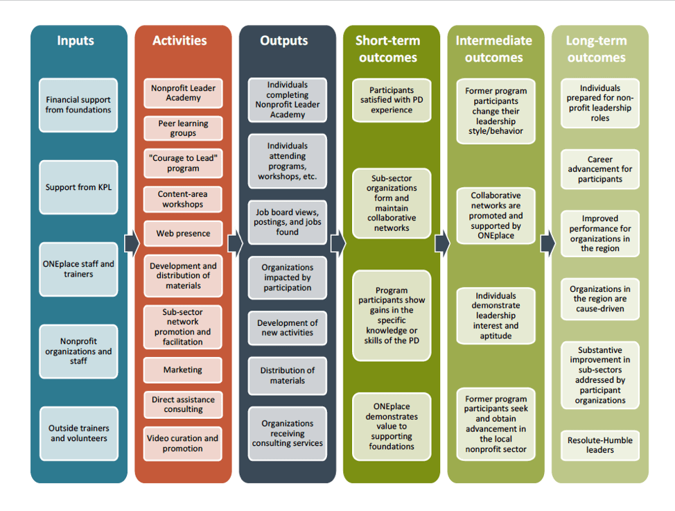
Interactive documents include a “launch page,” which gives a map-like overview of the whole document.

The launch page (see figure) allows readers to absorb the structure and main points of the document and to decide where they want to “zoom in” for more detail. I try to follow the wise advice of Edward Tufte: “Don’t ‘know your audience.’ Know your content and trust your audience.” He argues that we shouldn’t try to distill key points and simplify our data to make it easier for audiences to absorb. Readers will each have their own agendas and priorities, and we should make it as easy as possible for them to access the data that is most useful to them.
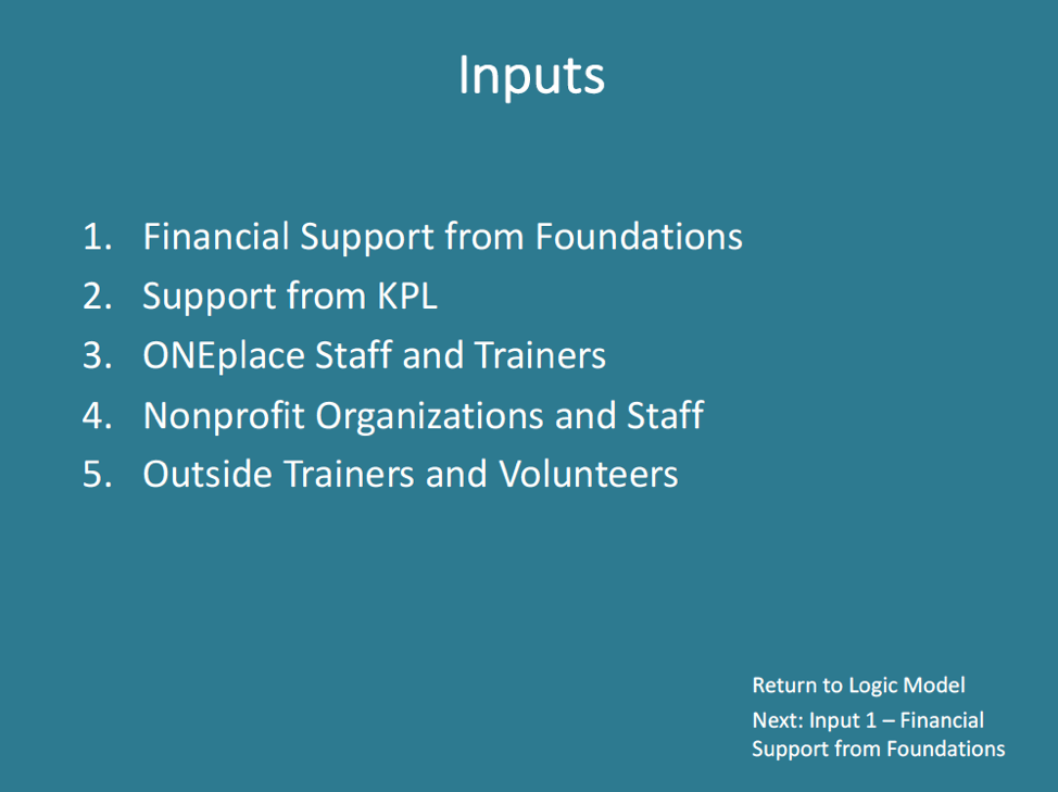
The launch page of an interactive document should have links all over it; every item of content on the launch page should lead readers to more detailed information on that topic. Every subsequent page should be extremely focused on one topic. If there is too much content within one topic, you can create another launch page focused on that particular topic (e.g., the “Inputs” section of the logic model).

The content pages should have buttons (i.e., links) that allow readers to navigate back to the main launch page or forward to the following page. If there’s a more detailed document that you’re building from, you may also want to link to that document on every page.
Try it out! Remember to keep your interactive document concise and navigable.

Except where noted, all content on this website is licensed under a Creative Commons Attribution-NonCommercial-ShareAlike 4.0 International License.


 EvaluATE is supported by the National Science Foundation under grant numbers 0802245, 1204683, 1600992, and 1841783. Any opinions, findings, and conclusions or recommendations expressed on this site are those of the authors and do not necessarily reflect the views of the National Science Foundation.